38 Don’t Ruin a Great Presentation with Terrible Slides
Lynn Meade
The more strikingly visual your presentation is,
the more people will remember it.
And more importantly, they will remember you.
– Paul Arden
Creative Director of Advertising Company Satchi and Satchi
The speaker was a master in his field which is why he was chosen to speak. He was brilliant, he was motivated to share his ideas, and he was great at conversation. The only problem was he was the most boring speaker I have ever heard. He stood at the front of the room and read presentation slides to us for two hours. He rarely looked at the audience. It was the longest two hours of any conference I have ever attended.
Chances are you have had a similar experience. A speaker has ridiculous amounts of text on a slide and then stands there and reads it to you. Unfortunately for all of us, a lot of college classes are that way. In fact, most of us learned about how to use slides by seeing our teachers use them–poorly.
The use of electronic slides–PowerPoint, Presenter, Google Slides, Prezi—is pervasive. Sixty-seven percent of college students reported that instructors used PowerPoint; and of these instructors, 95% used this software all or most of the time. Numerous articles chide that presentation slides might be the death of education.
Many successful speakers have shunned slides altogether. Chris Anderson, head of TED, the highly successful group that leads TED Talks, highlights at least of third of the most viewed TED talks do not use any slides whatsoever.
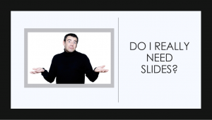
The Most Important Questions of All
- Do I need slides?
- If I need slides, what does the audience need to get from those slides?
I once made a presentation to NASA scientists who were preparing to talk about their research. I said, “If you sit at your computer and you open your presentation software and begin writing your speech on your slides, you are making a slide show, not a speech. A good speaker always considers what the audience needs to hear and then uses slides to offer visual support to help the audience understand. If you start with the slides, you’ve got it backward. ” Two years later, I was traveling out of state and saw a man who was smiling at me as he approached–it was one of the scientists from the NASA talk. He looked at me and said, “I remember you because you changed the way I do things. That piece of advice, about never starting with your slides changed everything for me. I really struggled as a speaker until you told us we are making a speech, not a slide show. Since I have changed, people seem to like my presentations more and more likely to come up and talk to me about my research.”
Slides are Good Because They…
- Can create credibility. (Many people expect you to use slides and meeting that expectation gives you credibility.
- Help focus the audience’s attention.
- Help the audience visualize concepts.
- Help people take organized notes of a talk.
- Helps the speaker stay on track.
- Provides aesthetic appeal.
- Show something that may be hard to describe.
Slides are Bad Because They…
- Can distract from what the speaker is saying.
- Can hurt the speaker’s credibility when poorly constructed.
- Can cause people to mindlessly take notes without thinking about the content.
- Can be boring…especially when a speaker stands up there and simply reads the slides to an audience.
- Can lead to passive listening when a teacher uses them in the classroom and give the students a copy of the slides.
Rules for Slides
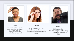
Write Your Speech First
As mentioned in the introduction, one of the most important things you can do when preparing your speech is to get away from your slide software. Under no circumstance should you open your slide software (PowerPoint, Presenter, Google slides, Prezi, Keynote, etc.) until your speech is complete and you have made a plan for what visuals the audience needs to see.
Keep Text to A Minimum
No more than six words across and six words down. Chris Anderson of TED specifies,
Even when a text slide is simple, it may be indirectly stealing your thunder. Instead of a slide that reads: A black hole is an object so massive that no light can escape from it, you’d do better with one that reads: How black is a black hole? Then you’d give the information from that original slide in spoken form. That way, the slide teases the audience’s curiosity and makes your words more interesting, not less.
Offer One Idea to a Slide
You can keep text to a minimum by limiting ideas to one per slide. Audience members should be able to glance quickly–about 3 seconds–and get all the information. It is better to have a lot of slides where each has only one idea per slide than it is to have one slide with a list of ideas. Nancy Duarte, communication coach, reminds us that if you have too many words, it is no longer a visual aid but a teleprompter. Estimate approximately how long it will take an audience member to read your slide by timing yourself reading the slide backward.
Think of your slides as billboards. When people drive, they only briefly take their eyes off their main focus — the road — to process billboard information. Similarly, your audience should focus intently on what you’re saying, looking only briefly at your slides when you display them. Nancy Duarte
Get Rid of the Title (Most of the time)
Most of the time, a title on each slide is not needed. You, the speaker, will say what the content is about; no need to read it–it is just distracting.
Reduce Cognitive Load
It is better to help the audience focus on the main point in the slide. By keeping things simple, it reduces the audience’s cognitive resources. There are several ways you can reduce cognitive load.
- Avoid busy backgrounds they can drain mental energy.
- Eliminate unneeded titles.
- Use basic, easy-to-read font.
- Ask yourself if the company logo or school banner is needed on the slide or if it just becomes one more thing.
- Keep background colors consistent
- Format photos and illustrations in the same style.
Use Pictures Instead of Words When Possible
People retain more information when what they see on the screen supports the message they are hearing.
We are incredible at remembering pictures.
Hear a piece of information,
and three days later you’ll remember 10% of it. A
dd a picture and you’ll remember 65%.
John Medina, author of Brain Rules.
Learning Recall Related to Type of Presentation
|
||||||||||||||
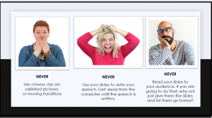
Avoid Distracting Slide Transitions
There is rarely a time when you should use the transition feature of the software. Things that twirl, cube, swap, and swoosh rarely help the audience to focus on your idea. Most of the time, they are just cheesy and distracting. Three transitions that can be used with a level of professionalism are cut, fade, and dissolve. The easiest rule is if you do not have a reason for a transition, don’t do it.
Use Easy-to-Read, Plain Font
Use 28-point font and larger. Do not use more than three different sizes and make the size variants purposeful. It is best to stick with a plain, sans-serif font such as Helvetica, Arial, or Tahoma. There are two types of font, serif (with fancy tails) and san serif (without fancy tails). The Plain, san serif font is easiest to read when projected.

Go For High Contrast
Always go for the highest contrast. I recently attended a special event and the speaker projected his side and then looked back at it surprised and said, “Sorry, you can’t see the red letters.” The speaker had attempted to put red letters on a black ground–this is always a no-no because it rarely shows well. It is best to pick a dark blue or back background and put white or yellow letters on it. You can also use a white or yellow background with dark black or blue letters (While JP Philips in the video Death by PowerPoint -below- advises against it, it is still a professional standard).
Use Minimal Bullets
If you do have bullet points, make sure you have more than one point because let’s face it, bullet points are for making lists and one point does not make a list. In addition, you should never have more than six bullet points because then you would have too much stuff on your slide.
Bullets belong to the Godfather.
Avoid them at all costs.
Dashes belong at the Olympics,
not at the beginning of the text.Chris Anderson, TED Talks
While I’m not sure I fully support eliminating all bullets, I do warn you to use them sparingly.
Use Blank Slides
You do not always have to have a slide behind you. Insert black, blank slides between points when you need to talk to the audience without the distraction of a visual.
Have a Backup Plan
Technology is evil and is the enemy of all that is good. It will crash on you. You should always have a backup plan and you should always be prepared to speak even if your slides do not work. You should always have notecards and I highly suggest printing out your slides to reference and then if the projector bulb goes out or the computer crashes, you can still make your presentation.
Test Your Slide Show, Videos, and Clicker/Remote
You should always practice using your slides. It is helpful to test out your presentation on your friends or trusted colleague and ask them to give you feedback. When you get to the place where you will give your presentation, it is a good idea to pull up your slides and make sure they work with the clicker/remote. It is a good idea to carry extra batteries with you too. Test the volume of your videos and make sure they play properly. Finally, make sure you know where the audio-visual person will be in case you have any problems. If you are a student, have a friend who can come up and fix your slides while you keep your speech going.
Avoid the Laser Pointer
A laser pointer highlights any shakiness you have in your hands. If you want to highlight something on a slide, use a graphic arrow.
Make Reminders on Your Notes to Change Your Slide
Many of my students will turn on their presentation slides and during the speech forget they are there. After they conclude their speech and we have applauded, they will look back at the projector and say, “Oh, here is my visual aid,” and then will rapidly click through the seven slides they should have shown us during the speech.
To avoid this, practice with your slides and mark on your notecards where to advance your slide. I usually draw an “S” in a circle and then color in the circle with a highlighter.
Point Your Body and Your Eyes Towards the Audience Not Towards the Slides
Your feet indicate where you want to go. If your feet are pointed towards the door, you are indicating you want to go out the door. Similarly, if your feet are pointed towards the back wall where your slides are located, it indicates you want to go towards your slides and not towards the audience. In short, you have turned your back on your audience. Point your feet, your hips, and your head towards the audience.
Keep your eyes on your audience and not your slides. Having brief slides helps. If you only have a few words or a nice photo on your slides, you are less tempted to stand there and read to the audience. In addition, having your notes in front of you as opposed to using your slides as your notes helps you keep pointed forward. Just remember, talk to your audience, not your slides.
Use Movement Minimally
These days, there are many different types of presentation slides. One of those is Prezi. For many (like me), the movement in Prezi creates a nauseous feeling. If you decide to use this tool, keep movement limited.
Here is a TED Talk that effectively uses Prezi.
Videos
Videos can be an amazing addition to your presentation. Rarely, do you want to use more than a one-minute clip. More likely, you will want about 30 seconds. In my experience, videos that work perfectly at your home computer have about a sixty percent chance of working at the venue where you speak. If you have a video file on your computer remember that the video file and the slide file have to go to the venue. The easiest way to do this is to create a file folder for your presentation and put the video file and the slideshow file in the folder. Save the file folder to the cloud or your thumb drive that you take to the venue. On the day of your presentation, go in ahead of time and make sure everything works and the volume on the video is set properly.
The most common mistake I see is someone will link their presentation to a video, and they bring a copy of the presentation with them but leave the video on their home computer. I usually upload videos to my personal YouTube account, and also have them in file format on a USB I always include a link to the video on my slide just in case it doesn’t work.
GIFS
Sometimes they work. Sometimes they don’t. GIF means graphic interchange format and is usually a short animation. If you decide that the GIF enhances your message and you decide to include it, make sure it works at the speech venue on the day you present. Be aware that a short GIF on a continual loop can be very annoying. A cartoon that waves once is cute, a cartoon that waves 20 times is distracting.
Give Credit for Visuals When Possible
When possible credit to the originator of the photo. Simply write “Photo credit: Name or originator of the photo.” Usually, 12-14-point font credit is centered under the photo or in the bottom right-hand corners. Be consistent in the way you do your citations. Citing your graphic may not look as nice as a plain slide, but it shows you have integrity, and that you give credit where it is due. Make sure you have a legal license to use the photo or they are listed as Creative Commons; better yet, do as a friend of mine does, always use your original photos.
Thoughts About Fair Use
The internet makes it easy to get photos, videos, and music that you can use in your presentation. Just because it is easy to get, doesn’t mean it is legal.
Chances are you are using this textbook because you are a college student. Because your presentations are of an educational nature, they are protected under Fair Use copyright laws which means you can use copyrighted material once for educational purposes if you give credit to the authors.
Once you graduate and work for a company, what was once considered free to use is now under a different system. For example, you may have to get permission to use someone’s photos or you may now have to pay to use a music clip.
Baylor University put together a checklist to help determine whether something would be considered fair use.
Use Photos Wisely
When using photos, it is usually best to make them full screen if the picture is the point of the visual. If they are a decoration to the point, format them so they are visually pleasing and balanced with the words. If you do use a smaller photo, use a plain background. Always use pictures with the highest resolution possible and always give photo credit. In the college classroom, students prefer pictures and “visually rich” slides if they were relevant to the content of the lecture. In addition, they preferred minimal text and limited bullet-point lists.
Don’t Do This!
|
What’s Wrong With This Slide?
|
Do This Instead!
|
What’s Right With This Slide?
|


Want to Take Your Slide Composition to the Next Level? Check out these Resources
To see a great explanation with examples of why certain slide layouts work.
https://www.presentation-process.com/powerpoint-slides.html
To see samples of good and bad use of photos on slides, check out Presentation Zen.
https://www.presentationzen.com/presentationzen/visuals/
To take your visual composition to the next level by using the rule of thirds to compose slides, check out the rule of thirds.
http://sixminutes.dlugan.com/rule-of-thirds-powerpoint/
To see the types of slides a professional designer makes.
https://www.nolanhaimscreative.com/presentation-design-portfolio
To see design principles
https://courses.lumenlearning.com/ivytech-comm101-master/chapter/chapter-13-design-principles/
Nancy Duarte: [For visuals], I think people tend to go with the easiest, fastest idea. Like, “I’m going to put a handshake in front of a globe to mean partnership!” Well, how many handshakes in front of a globe do we have to look at before we realize it’s a total cliche? Another common one — the arrow in the middle of a bullseye. Really? Everyone else is thinking that way. The slides themselves are supposed to be a mnemonic device for the audience so they can remember what you had to say. They’re not just a teleprompter for the speaker. A bullseye isn’t going to make anyone remember anything. Don’t go for the first idea. Think about the point you’re trying to make and brainstorm individual moments that you’re trying to emphasize. Think to the second, the third, the fourth idea — and by the time you get to about the tenth idea, those will be the more clever memorable things for the audience.
Watch Mac Stone as he shows photos that make “You want to save the Everglades.”
Be in the Image but Not on the Image
Stand near your slides but don’t stand where you will be a shadow on your slides. Sometimes a presenter will stand far away from their slide causing the audience to have to bounce back and forth with their attention. On the other hand, practice with your slides at the venue and have a friend let you know where you can and cannot stand. If it is easy to stand in front of the slides, I will sometimes put tape on the floor to indicate where to stand and put a tape boundary to remind myself where not to stand.
These Are Not the Same
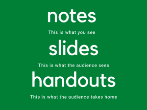
Should I Give Out My Slides As a Handout?
One BIG mistake novice speechmakers make is they use their slides as their notes, their visual aid, and their handout. In this model, a speaker opens up the presentation software and writes their speech on the slide. When the day of the presentation comes along, the speaker stands in front of the audience and reads the slides to the audience. Finally, the speaker gives the audience members a copy of the slides to take home.
Delivery Notes are what you look at during your presentation. They should have details about what you will say, they should have reminders for when to advance your slides, and they should have notes reminding you to project your voice or to look up.
Slides are the projection the audience sees. They should be purposeful, brief, and concise, and designed to help listeners understand.
Handouts are the items you give the audience to take home with them. It should provide only the information the audience needs to remember after your presentation is over.
Never, ever hand out copies of your slides, and certainly not before your presentation. That is the kiss of death. By definition since slides are “speaker support” material, they are there in support of the speaker…You. As such, they should be completely incapable of standing by themselves and are thus useless to give to your audience, where they will simply be guaranteed to be a distraction. The flip side of this is that if the slides can stand by themselves, why the heck are you up there in front of them? (David Rose as quoted in Presentation Zen)
With that said, when students spend their attention copying slides, they do not spend time listening to the lecture. Making the slides available to students to use during an educational lecture may reduce cognitive load and encourage learning. However, if the slides are so detailed the student can get all the information from the slide, then they may not attend class or they may not take any notes of their own which reduces learning. It is a delicate balance of structure but not all the content.
How To Avoid Death by PowerPoint
Watch the Video How to Avoid Death By PowerPoint
Okay, ladies and gentlemen, welcome. There is a question which has puzzled me for quite a while, and that is, why do our PowerPoints look the way they look? Or rather, how on earth, can we accept that they look the way they look? How can you do that?
And do you know what’s even more intellectually challenging for me to understand, is how can a person sit over here in this meeting room with ten others, observing this dismally bad PowerPoint filled with charts, graphical elements, page numbers, fading away five, seven minutes thinking of other things. You know the feeling, the boredom, the waste of time!? This person, after 40 minutes, he/she will stand up, a bit dazed, trotting off to his own office, coming to his own computer, flipping it up, going like: oh my god, I’ve got a presentation tomorrow, and I do have a PowerPoint to build. Now what is the chance that this person will build an equally bad PowerPoint as the one that he/she was by herself tortured by in the other conference room? Is that a big chance? Yeah. David JP Phillips, TED Speaker. How to Avoid Death By Power Point
David JP Phillip Provides This Solution
- Only put one idea per slide.
- Make spoken and projected content match. Don’t make an audience chose between listening to you or looking at your slide. Sweller and Mayer conclude there is something in our brain called the redundancy effect, and it works like this. If the audience has to pick between reading text on a slide or listening to you talk, they have a hard time focusing and cannot recall most of what was said.
- Build slides with minimal distractions. We pay attention to moving objects, signaling colors, contrast-rich objects, big objects. Build your slides with this in mind. For example, only have a large title if it is the most important, otherwise, make it smaller.
- Avoid using full sentences on slides.
- Contrast controls your focus. If you use a white background, it draws attention away from the speaker.
- Do not put too many objects on your slide. Go for six or less.
Watch These Creative Uses of Slides
Notice how Tim Urban uses slides to engage the audience. Instead of long lists of words, he uses funny drawings, which results in the audience hanging on his every word.
Do Slides Help or Hurt Student Learning?

A group of researchers set out to find out if there is a connection between the use of slides by teachers and student learning. They looked at all the studies that had been done on the topic and they made a chart to look at similarities and differences (it is called a meta-analysis). The results were interesting.
They found that students expected teachers to use slides in classes. Students self-reported that they liked when a teacher used slides. Students thought that slides helped them to learn and to pay attention. This was particularly true for STEM (Science, Technology, Engineering, and Math) fields, where many slides contain projected models and diagrams.
While students perceived it was helpful, research indicates there is little or no effect on either test scores or information retention. I would argue that there is increasingly an expectation that speakers use slides. Because of this, a speaker who chooses not to use slides may violate audience expectations resulting in lower credibility.
Here is a summary of various educational studies regarding slides in classroom learning:
- Students who downloaded class slides before class improved exam scores by 3.48%
- Students performed worse on recall and recognition tasks when slides included pictures that were not relevant.
- Slides that show positive pictures enhanced learning more than negative pictures.
- In an older study (2005), students said they preferred teachers to write on the board and use props rather than show slides.
- Students who preferred it when the teacher wrote on the board said that they liked it better because there was more active engagement, a more appropriate pace, and less extraneous material given.
- Students who preferred slides said they liked being able to have copies of slides in case they were absent or in case the notes they had were complete.
**Notice in this section, I did not mention each specific study and researcher. I did it so you could most easily get the information and think about it as it related to your own academic experiences. The studies referenced are below. When you give your speech, similarly, you should decide when it is best to include references at the bottom of each slide or to put them all at the end. Context should always guide you on how best to manage your sources. There is an entire chapter dedicated to thinking about how to manage research.
Baker, J. P., Goodboy, A.K., Bowman, N.D., Wright, A.A. (2018). Does teaching with PowerPoint increase students’ learning? A metanalysis. Computers and Education Science Direct, 126. 376-387 https://doi.org/10.1016/j.compedu.2018.08.003
Bartsch, R.A. & Cobern, K.M. (2003). Effectiveness of PowerPoint presentations in lectures. Computers and Education 41(1), 77-86. https://doi.org/10.1016/S0360-1315(03)00027-7
Berk, R. A. (2012). Top 10 Evidence-based Best Practices for PowerPoint in the Classroom. Transformative Dialogues: Teaching & Learning Journal, 5(3), 1-7.
Chen, J. & Lin, Tsui-Fang (2008). Does downloading PowerPoint slides before the lecture leads to better student achievement. International Review of Economics Education, 7 (2), 9-18, https://doi.org/10.1016/S1477-3880(15)30092-X
Hill, A., Arford, T., Lubitow, A., & Smollin, L. M. (2012).“I’m ambivalent about it”: The dilemmas of PowerPoint. Teaching Sociology, 40, 242–256. https://doi.org/10.1177/0092055X12444071
Mantei, E. J. (2000). Using internet class notes and PowerPoint in the physical geology lecture. Journal of College Science Teaching, 29(5), 301–305. https://www.learntechlib.org/p/91984/.
Marsh, E. J., & Sink, H. E. (2010). Access to handouts of presentation slides during lecture: Consequences for learning. Applied Cognitive Psychology, 24, 691–706. https://doi.org/10.1002/acp.1579.
Moulton ST, Türkay S, Kosslyn SM (2017) Does a presentation’s medium affect its message? PowerPoint, Prezi, and oral presentations. PLoS ONE 12(7): e0178774. https://doi.org/10.1371/journal.pone.0178774
Nelson-Wong, E., Eigsti, H., Hammerich, A., & Ellison, N. (2013). Influence of presentation handout completeness on student learning in a physical therapy curriculum. The Journal of Scholarship of Teaching and Learning, 13, 33–47. https://files.eric.ed.gov/fulltext/EJ1017035.pdf
Nouri, H., & Shahid, A. (2005). The effect of PowerPoint presentations on student learning and attitudes. Global Perspectives on Accounting Education, 2,53–73. (no doi).
Ogeyik, M. C. (2017). The effectiveness of PowerPoint presentation ad conventional lecture on pedagogical content knowledge attainment. Innovations in Education &Teaching International, 54, 503–510.https://doi.org/10.1080/14703297.2016.1250663.
Unique Rules for Academic Presentation Slides
Whether you are presenting in a graduate class or at a conference, there are certain expectations regarding slides that are much different than business or undergraduate class slides. Academic slides should be able to stand alone and provide a clear summary of your work.
- Your slides should include academic references at the bottom of the slide.
- Your slide should include details about the point being made. Someone who did not come to your presentation but got a copy of your slides should be able to understand the point.
- Your slide should include a citation for photos. Academic integrity is important.
- Your slides should include a reference page as the last page. This will not be shown to your audience at the presentation but is only included because of its handout value. Many conferences and graduate classes require you share your slides. Including your reference page as the last slide gives everyone access to your full list of references.
- Include your name and contact information on the opening and closing slides. You want people to have your information in case they want to contact you with questions or want to work with you on future projects. In academic conferences, people are going from room to room to find the right place to go. Make it easy for them to know they are at the right location by having a slide with the title and name from the program.
- You should name your talk something interesting that makes people want to attend. Oftentimes, academic titles are boring so label your talk something that draws in an audience. You can include a copy of your actual research paper in the uploaded materials, or you can reference the title of your paper in your talk. You are not obligated to name your talk after your journal article title.
- Some academics are including Twitter handles and hashtags related to the conference so attendees can network.
- Many conferences ask for the slides in advance and will put them on a website and make them downloadable for all participants. For this reason, your slides should be able to provide stand-alone information–meaning someone who did not attend your presentation could understand your talk.
- Think about your slides as your business card. Some people may see these slides without ever meeting you. They will judge you based on your slides–make a good first impression, your future may depend on it.

How to Put Citations in Slides
When considering the how and when of citations, it is important to consider the context of your speech. Different contexts will require different types of citations. Many speakers have ended their presentation with, “And here’s my reference page.” That has got to be the most boring way to end a speech ever! Don’t do it. There is never any reason to project your reference page for your audience to see. Depending on the context, however, you may include your reference on your slide.
|
A student in a |
A College Teacher
|
A Businessperson |
| In class, you should always verbally mention your research and you should turn in a complete reference page. Teachers will vary if they want you to include the full reference on the bottom of the slide. You should always ask the teacher. |
Typically, in graduate-level classes, students and teachers are expected to offer full citations. These are likely to be in the form of a reference page given to the audience in paper or electronic form. Each discipline is different. When in doubt, include the full reference at the bottom of a slide.
|
You will have to read into the context of this one. You should always mention any research to give you credibility but whether you put a citation on the slide will vary from place to place. When in doubt, err on the side or including the citation. Business presentations rarely include citations on photos. |
Key Takeaways
Remember This!
- Slides should always be used purposefully.
- Write your speech before making your slides.
- It is better to have many slides that each make only one point than it is to have few slides with many points.
- No more than six words across and six words down, use at least 28-point, plain (san-serif) font.
- Different contexts have different expectations for slide design.
Please share your feedback, suggestions, corrections, and ideas.
I want to hear from you.
Do you have an activity to include?
Did you notice a typo that I should correct?
Are you planning to use this as a resource and do you want me to know about it?
Do you want to tell me something that really helped you?
Bonus Feature
Watch a part of Sonaar Luthra’s speech for a great example of slide usage. The pictures help us to understand and remember and he avoids unnecessary words.
For those of you interested in Multi-Media Learning Principles, this chart explains how to each principle applies to good slide creation.
Multimedia Learning
|
||
What does it mean? |
What does it mean
|
|
| Multiple Representation Principle
|
For meaningful learning to occur, both channels (verbal and visual) should be used at the same time in a way learners can connect the information from each channel. |
|
| Temporal Contiguity Principle |
Don’t be talking about one thing and have a picture up of something else. Verbal and visual content should be presented together in contiguous time. Putting words and pictures explaining the same content into working memory at the same time is beneficial. If the information is out of synch, the brain is less able to connect the information from the two inputs.
|
|
| Split Attention Principles
and |
People learn best when their attention is not split between spoken and visual words.
|
|
| Redundancy Principle |
While two channels of content that support each other can be more effective, too much can cause cognitive overload. |
|
| Coherence Principle |
Background sounds and music can overload auditory channels and distract. |
|
| Image Principle |
People do not learn better when the speaker’s image is on the screen. |
|
References
Anderson, C. (2016). TED talks: The official TED guide to Public Speaking. Boston: Houghton Mifflin Harcourt.
Armour, C. Schneid, S.D., & Brandl, K. (2016). Writing on the board as students’ preferred teaching modality in a physiology course. Physiology. https://doi.org/10.1152/advan.00130.2015
Baker, J. P., Goodboy, A.K., Bowman, N.D., & Wright, A.A. (2018). Does teaching with PowerPoint increase students’ learning? A metanalysis. Computers and Education Science Direct, 126, 376-387. https://doi.org/10.1016/j.compedu.2018.08.003
Bartsch, R.A. & Cobern, K.M. (2003). Effectiveness of PowerPoint presentations in lectures. Computers and Education. 41(1), 77-86. https://doi.org/10.1016/S0360-1315(03)00027-7
Berk, R. A. (2012). Top 10 Evidence-based Best Practices for PowerPoint in the classroom. Transformative Dialogues: Teaching & Learning Journal, 5(3), 1-7.
Brandl, K., Scheid, S., & Armour, C. (2015). Writing on the board vs PowerPoint: What do students prefer and why? Pharmacology. 29(1). https://doi.org/10.1096/fasebj.29.1_supplement.lb465
Chen, J. & Lin, Tsui-Fang (2008). Does downloading PowerPoint slides before the lecture leads to better student achievement. International Review of Economics Education 7 (2), 9-18, https://doi.org/10.1016/S1477-3880(15)30092-X
Copyright and Fair Use: Common Scenarios from California State University. https://csulb.libguides.com/copyrightforfaculty/scenarios
Dale E. (1969). Cone of experience, in Educational Media: Theory into Practice. Wiman RV (ed). Charles Merrill.
Duarte, N. (2008). Slide:ology: The are and science of creating great presentations. O’Reilly.
Duarte, N. (2012). Do your slides pass the glance test? https://hbr.org/2012/10/do-your-slides-pass-the-glance-test
Duarte, N. (2010). Resonate Present visual stories that transform audiences. John Wiley & Sons.
Endestad, T., Magnussen, S., & Helstrup, T. (2003). Memory for Pictures and Words following Literal and Metaphorical Decisions. Imagination, Cognition and Personality, 23(2), 209–216. https://doi.org/10.2190/PNXA-4078-M1H9-8BRJ
Garr, G. (2008). Presentationzen: Simple ideas on presentation design and delivery. New Riders.
Hill, A., Arford, T., Lubitow, A., & Smollin, L. M. (2012).“I’m ambivalent about it”: The dilemmas of PowerPoint. Teaching Sociology, 40, 242–256. https://doi.org/10.1177/0092055X12444071
Joyce, B. & Showers, B. (1981). Transfer of training: the contributions of coaching. Journal of Education 163(2): 163–172. https://doi.org/10.1177/002205748116300208
Kasperek, S. Design Principles. (2011). The Public Speaking Project. http://publicspeakingproject.org/psvirtualtext.html
Kosslyn, S. M. (2007). Clear and to the point: Eight psychological principles for compelling PowerPoint presentations. Oxford University Press.
Lacey, S., Stilla, R., & Sathian, K. (2012). Metaphorically Feeling: Comprehending Textural Metaphors Activates Sensory Cortex. Brain and Language. 120, 3. 416–421. http://doi.org/10.1016/j.bandl.2011.12.016
Malamed, C. (2009). Visual language for designers: Principles for creating graphics that people understand. Rockport Publishers
Luthra, S. (2012). Sonaar Luthra: Meet the water canary. [Video]. YouTube. https://youtu.be/gv1ApCmctVQ?t=27 Standard YouTube License.
Mantei, E. J. (2000). Using internet class notes and PowerPoint in the physical geology lecture. Journal of College Science Teaching, 29(5), 301–305. https://www.learntechlib.org/p/91984/.
Marsh, E. J., & Sink, H. E. (2010). Access to handouts of presentation slides during lecture: Consequences for learning. Applied Cognitive Psychology, 24, 691–706. https://doi.org/10.1002/acp.1579.
Mayer, R. E. (2001).Multimedia learning.New York, NY: Cambridge University Press.Mayer, R. E., & Moreno, R. (2002). Animation as an aid to multimedia learning.Educational Psychology Review, 14,87–99. https://doi.org/10.40-726X/02/0300-0087/0.
Mayer, R. E., & Moreno, R. (2003). Nine ways to reduce cognitive load in multimedia learning. Educational Psychologist, 38,43–52. https://doi.org/10.1207/S15326985EP3801
Medina, J. (2018). Brain rules. http://www.brainrules.net/vision
Miller, S. T., & James, R. C. (2011). The effect of animations within PowerPoint presentations on learning introductory astronomy. Astronomy Education Review, 10,1–13. https://doi.org/10.3847/AER2010041.
Moulton, S.T., Türkay, S. & Kosslyn, S.M. (2017). Does a presentation’s medium affect its message? PowerPoint, Prezi, and oral presentations. PLoS ONE 12(7): e0178774. https://doi.org/10.1371/journal.pone.0178774
Nelson-Wong, E., Eigsti, H., Hammerich, A., & Ellison, N. (2013). Influence of presentation handout completeness on student learning in a physical therapy curriculum. The Journal of Scholarship of Teaching and Learning, 13, 33–47. https://files.eric.ed.gov/fulltext/EJ1017035.pdf
Nouri, H., & Shahid, A. (2005). The effect of PowerPoint presentations on student learning and attitudes. Global Perspectives on Accounting Education, 2,53–73. (no doi).
Nowaczyk, R. H., Santos, L. T., & Patton, C. (1998). Student perception of multimedia in the undergraduate classroom. International Journal of Instructional Media, 25 (4), 367–382. (no doi).
Ogeyik, M. C. (2017). The effectiveness of PowerPoint presentation ad conventional lecture on pedagogical content knowledge attainment. Innovations in Education &Teaching International, 54, 503–510.https://doi.org/10.1080/14703297.2016.1250663.
Presentation aids Design Principles. Lumen Learning. https://courses.lumenlearning.com/ivytech-comm101-master/chapter/chapter-13-design-principles/#return-footnote-1129-36
Ramgopal & Arte. (n.d.). Presentation Ppocess. https://www.presentation-process.com/powerpoint-slides.html
Reynolds, G. (2008). Presentation Zen: Simple ideas on presentation design and delivery. New Riders.
Schneider, S., Nebel, S, & Rey, G.D. (2015). Decorative pictures and emotional design in multimedia learning. Learning and Instruction 44, 65-73. https://doi.org/10.1016/j.learninstruc.2016.03.002
Steinert, Y. & Snell, L.S. (2009). Interactive lecturing: Strategies for increasing participation in large group presentations. Medical Teacher. 21:37–42. https://doi.org/10.1080/01421599980011
Stenberg, G (2006). Conceptual and perceptual factors in the picture superiority effect. Europen Journal of Cognitive Psychology. 18. 813-847. https://doi.org/10.1080/09541440500412361
Swerdloff, M. (2016). Online learning, multimedia, and emotions. In S. Y. Tettegah & M. P. McCreery (Eds.), Emotions and technology: Communication of feelings for, with, and through digital media. Emotions, technology, and learning (p. 155–175). Elsevier Academic Press. https://doi.org/10.1016/B978-0-12-800649-8.00009-2
Torgovnick May, K. (2012). How to give more persuasive presentations: A Q & A with Nancy Duarte. TED Blog. https://blog.ted.com/how-to-give-more-persuasive-presentations-a-qa-with-nancy-duarte/
Vogel, D. R., Dickson, G. W. & Lehman, J. A. (1986). Persuasion and the role of visual presentation support: The UM/3M Study.
Wecker, C. (2012). Slide presentation as speech suppressors: When and why learners miss oral information. Computers & Education, 59, 260–273. https://doi.org/10.1016/j.compedu.2012.01.013.
Wilmoth, J., & Wybraniec, J. (1998). Profits and pitfalls: Thoughts on using a laptop computer and presentation software to teach introductory social statistics. Teaching Sociology, 26, 166–178. https://doi.org/10.2307/1318830
Worthington, D. L., & Levasseur, D. G. (2015). To provide or not to provide course PowerPoint slides? The impact of instructor-provided slides on student attendance and performance. Computer Education, 85,14–22. https://doi.org/10.1016/j.compedu.2015.02.002
Media Attributions
- Don’t Make Terrible slides © Lynn Meade is licensed under a CC0 (Creative Commons Zero) license
- Do I really need slides © Lynn Meade is licensed under a CC0 (Creative Commons Zero) license
- Always do this for your slideshow © Lynn Meade is licensed under a CC0 (Creative Commons Zero) license
- 640px-Latin_alphabet_Ss.svg © Erik1231 is licensed under a CC0 (Creative Commons Zero) license
- Never do this for your slideshow © Lynn Meade is licensed under a CC0 (Creative Commons Zero) license
- Slide Sample © Lynn Meade is licensed under a CC0 (Creative Commons Zero) license
- slide 3 © Lynn Meade is licensed under a CC0 (Creative Commons Zero) license
- The difference in notes, slides, handouts © Lynn Meade is licensed under a CC0 (Creative Commons Zero) license
- Bored Students
- Slide for academics
- Academic slide cover
