10 Designing Your Portfolio: You are the Information Architect
Lynn Meade

In this chapter, we will talk about collecting things for your portfolio, matching your portfolio to your purpose and audience, the parts of a portfolio, and design principles for creating things online. First things first, let’s get started with collecting content for your portfolio.
Organize Your Contents
 I recently helped someone build his first portfolio. He said it was a lot easier because he had clearly marked folders of materials on his computer. He had a folder for his study abroad photos, a folder for his important homework assignments, and a folder for his resume. When it came time to assemble his portfolio, he not only had great items to use in his portfolio, but he was also able to look through the folder at his photos and homework to get ideas for things to include.
Start by creating a folder. Add things that you think should be included in your portfolio. Include anything bragworthy. Add interesting photos of you doing interesting things. Add more items than you think you will use–it is better to have too much rather than not enough.
What types of things should you put in your folder? Anything that demonstrates your skills and showcases your personality. This might be photos of you in action, photos of projects, papers you have written, or feedback teachers have written to you. These items are called artifacts and there is an entire chapter dedicated to showing you how to collect, select, reflect, and connect the things you have in your folder: Showcasing Your Artifacts.
Clearly label items. Labeling things as you go can be helpful when it comes time to assemble. Instead of using a generic label such as “essay,” label it “Comparative essay from Dr. Smith’s Composition 2 class.” If you have a lot of things in your folder, you might even break it into subfolders: volunteer work, coursework, and personal projects.
Pick Your Platform
The platform is the place online where you will put your portfolio. Many colleges will have a centralized platform with preloaded templates for students to use. If you do not have a school platform, you can build a site for free using Wix, Weebly, Google Sites, or many other free programs you might find online.
When picking your platform, you should ask these questions:
- How easy is this platform to use and do I have the skill to use it?
- Is technical support available for this platform?
- Do I own my site and can I take it with me once I graduate?
- Will there be advertisements put on my site?

Define your Purpose and Audience
Throughout the portfolio-building process, you should keep asking “What is the purpose of my portfolio” and “Who will be looking at my portfolio?” Once you have the answer to those two questions, you will have a better idea of what to include and how to structure it. Your audience and purpose will cause you to include some things and exclude others.
Pick Your Structure
Now that you have your platform and a folder of items to include and you have a clear purpose, it is time to decide what to include in your portfolio and how you want to structure your items.
There are many variations on portfolios, but what follows is a list of core items found in many professional portfolios.
Landing Page/Home Page
The landing page is the first page people see. For some, the About Me Page is their landing page and for others, they make a separate welcome page.
About Me Page
The About Me Page is targeted information about you and your learning journey. Overall, this is about you as a student or about you as a professional.
Resume / Curriculum Vitae
Include an updated resume or vitae. This is a good place to add a link to your LinkedIn page.
Artifacts
Artifacts are the objects that you display in your portfolio that give evidence to back the story you are telling. Be sure to label them clearly and provide a detailed reflection for each.
Reflections
Your portfolio should include numerous narratives that tell your story. Use reflective writing to tell the story of your strengths and the meaning behind your artifacts.
Navigation
It is important for you to have an easy way to navigate these pages and access all the content. Navigation is crucial. Ask yourself, “Can an average person navigate my site with ease?” In a survey of employers, one wrote, “I really appreciated how I had options that I did not have to look at the whole thing to find what I wanted. I liked having options to see what I wanted to see—to navigate quickly.”
Contact Information
Let your reader know how to contact you. It is best to create a contact information page that will send you an email since you probably don’t want your email address, phone number, and address on the internet.
Course Objectives
It is increasingly popular for programs to ask you to make a portfolio as part of a capstone for your college program or as a final assignment as part of a central course. These types of portfolios are used so you can demonstrate how you have mastered each of the course/program objectives. If this is the case, you should follow the assignment closely. If given the freedom, you should also design it in a way that it will be easy for you to convert it to a career portfolio.
Career Competencies
Many college portfolios will include career competencies. What this means is that you will organize the content in a way that you have learned about career competencies. What that means is that you will use the career competencies as major headings.

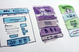
Design the Structure: You are the Architect!
Portfolios are as personal as the people who make them, that is what makes them so appealing. In the same way, an architect has a master plan for how things will fit together, you are the information architect who decides what items you want to showcase and how those items should be arranged.
Your portfolio should be organized in a logical fashion that is suited to the portfolio’s application but is reflective of your personality. It can be helpful to sketch a diagram of how your portfolio will all fit together. When working with web design, there are certain key principles to follow: Design it as art, use white space, use fonts and letters that are accessible, use design principles, and make sure it can be viewed on different devices.
Design it as “Art”
Many years ago, I visited a career consultant who looked at my resume. She picked it up and walked across the room. When she got to the farthest wall in the room, she stood there and held it to the wall. “Is it art?” she asked. “Look at the balance between words and whitespace. Now, look at the headings and the format. Don’t look at the words, just look at the whole thing as a piece of art. How does it make you feel?”
I had mixed feelings about her asking me these very awkward questions. First, it wasn’t what I was expecting in this consultation, but second, it made me feel bad because my resume failed the “art test.” It was so packed with words that it looked like an overwhelming mess. That lesson forever changed the way I design text-based items.
All professional items –resumes, portfolios, slides, flyers, websites–should all pass the “art test.” You should stand back from your portfolio and look at it, not as words, but as art. Before anyone reads your portfolio, they will see the visual that is your portfolio, and they will form an impression of you based on that initial viewing. One key factor in passing the art test is your use of white or negative space.
Make Use of White Space
What is white space? It is the negative or empty space around your design or your words which is why it is sometimes called negative space. Fun fact, white space doesn’t have to be white, it can be any color. It counts as white space because it creates a blank spot, so things don’t look cluttered. White space helps to focus attention on key aspects of the page and it reduces overload. In one study, having white space between the lines of a paragraph increased comprehension of the materials by up to 20%.
“White space in design composition is same as use of silence in a musical composition. Without proportionate use of silence, music is unstructured; some may call it noise. Similarly, without white space, design is unstructured and difficult to consume.” Mark den Hartog
Apply Best Practices for Font Types and Letter Sizes
Your portfolio might be viewed on a phone, a tablet, or a computer, so be sure it is readable on all devices. One way to do that is to carefully consider when picking fonts and sizes. For example, some cursive fonts do not work on some devices and other fonts may change to a smaller font version when viewed on some devices.
Using a plain san-serif font of 14 to 16 points is usually your best bet. Look at the S’s below, can you tell the difference? One set has frills or tails called serifs and one does not. Because plain letters are the easiest to read digitally, 85% of web-based fonts are plain, sans-serif font.

Top 5 fonts plain (san-serif) fonts for web use:
- Arial
- Helvetica
- Helvetica Neue
- Roboto
- Tahoma
Follow Key Design Principles
Since your portfolio is essentially a webpage with a purpose, you should follow the best practices and design principles for websites. C.R.A.P. is an acronym created by Robin Williams (not the comedian) and used to describe four key design principles that all websites should follow: contrast, repetition, alignment, and proximity.
Contrast
Principle: Items should either be the same or very different. In general, high contrast provides more emphasis while low contrast provides less emphasis.
Example: Contrast large fonts with small fonts; thick lines with thin lines; or dark colors with light colors.
Repetition
Principle: Repetition creates consistency and helps the reader follow along. Repeat some aspect of design throughout the entire page or portfolio.
Example: Repeat design elements such as fonts, colors, or page layouts. Each page of your portfolio should use the same basic colors and the same basic style.
Alignment
Principle: Aligned items give the page coherence. Make sure nothing is placed randomly and there is a clear visual connection between elements.
Example: Don’t make it look sloppy with things randomly scattered all over the page. Make sure things line up and look balanced. Create hard lines by aligning text and visual elements in a straight line. Connect these items through left, right, centered, or staggered alignment.
Proximity
Principle: Place related items close to each other and space unrelated items far apart. Proximity ensures related items are seen as one cohesive group rather than a bunch of unrelated parts.
Example: Things that go together should be placed close to each other. Place an image and its corresponding text next to each other.
Watch this video for examples of web design principles.
- Pages should be easy to navigate.
- Always leverage negative space.
- Pages should be consistent but engaging.
- Embrace complementary colors.
- Design with your target audience in mind.
- Fonts should be readable and accessible.
- Follow Fitts Law (Make buttons big and easy to hit) and Hicks Law (Don’t make your readers have to make too many decisions).
- Use invariance: Make it obvious what is the most important.
- Buttons: Use language that will make people want to click the button.
- Leverage the pattern of F and Z: Design your site to follow the patterns of how people naturally look.
- Make it mobile-friendly.
- Break text into bite-sized chunks.
- Use grids.
- Remember balance: Color balance and visual balance.
- Pay attention to the details.

Design it to Be Viewed on Multiple Devices
Realizing that your portfolio will be viewed on many different platforms, take the time to check and see how it looks on your phone and tablet. Many programs have a special feature to let you preview your site on different devices.
Closing
In this chapter, we covered some of the most important things to get you started as you build your portfolio: readability and design. Later, we will talk about ethics and universal design and I will provide you with a checklist for your portfolio. When building your portfolio, you will find that it is not difficult if you take it one step at a time.
Key Takeaways
- Create a folder to store items that you might include in your portfolio.
- As the information architect, you should decide how things will be organized.
- Follow design principles for online content: CRAP: Contrast, repetition, alignment, proximity
- Balance items and use sufficient white space.
Ideas for Teachers
- Ask your students to create a folder of their clearly labeled artifacts. Have them turn in a screenshot of the folder and the labeled items as a way to check progress.
- Ask your students to draw an architectural map of their portfolio. Have them label the navigation and the major parts.
- Ask your students to take a screenshot of their portfolio on two different computers, on a phone, and on a table, and turn it in for a grade.
- As a practice exercise, ask students to imagine they are creating a theme for their portfolio. Have them find five stock photos to support that theme. For example, their theme might be “grow” and they have photos of trees and plants on one of the stock photo sites.
- Have students look at portfolios using different devices–tablet, phone, computer– and discuss the similarities and differences in how the portfolio looks on each device.
- Have students find bad examples of websites that violate any of the 15 web design principles
- Have bad examples (make a portfolio and then mess it up) for them to look at and ask them to label which web design principle was violated and have them tell you how to fix it.
- Give students two different audiences (for example an internship and a campus award) and have them describe how they might include different information for each.
References
Brown, I. (2021). University Writing. auburn.edu/writing
Cicchini, A. and Miron, L. (2022). Accessibility and Inclusivity Guide from University Writing. auburn.edu/writing. Copyright:Attribution-NonCommercial-ShareAlike CC License
Flores, A., & James, C. (2012). Morality and ethics behind the screen: Young people’s perspectives on digital life. New Media & Society, 15(6), 834-852. doi:10.1177/1461444812462842
Hegde, P. (2017). Importance of white space in design. https://blog.prototypr.io/importance-of-white-space-in-design-5a40c0e65bfd
Holcombe, J. (2022). 15 Web Design Principles for a Customer-Friendly Website. https://kinsta.com/blog/web-design-principles/
Peachpit Press. University Writing Copyright: Attribution NonCommercial-ShareAlike CC License https://auburn.app.box.com/s/kr7qycnu86o3doge21mvi1w73sw4ctaf
National Universal Authority. What is Universal Design? https://universaldesign.ie/what-is-universal-design/
Nuessler, S. (2012). EDUC8011—Action research project. Unpublished manuscript, Teaching and Learning Centre, University of Canberra, Canberra, Australia.`
Reynolds, N. & Davis, E. (2014). Portfolio Keeping: A Guide for Students. Bedford St. Martin.
Stuart, H & Wade, Pl. (2019). Adapted from Megan Haskins & Ryan Laysaght Adapted from Williams, R. (2014). The non-designers design book: Design and typographic principles for the visual novice (4th ed.). Peachpit Press. | University Writing | (334) 844-7475 | auburn.edu/writing | universitywriting@auburn.edu | Copyright: Attribution-NonCommercial-ShareAlike CC License https://auburn.app.box.com/s/kr7qycnu86o3doge21mvi1w73sw4ctaf
Vaughan, M. (2021). There’s No Alternative to Good ALT Text. Dubbat. https://dubbot.com/dubblog/2021/theres-no-alternative-to-good-alt-text.html
Williams, R. (2014). The non-designers design book: Design and typographic principles for the visual novice (4th ed.).
Wilson, C.B., Downer, T., Slade, C. Fisher, M.B., Kirby, M.M. Nuessler, S. (2018). Digital ethics and the ups of ePortfolio: A scoping review of the literature. International Journal of ePortfolio 8(2). https://files.eric.ed.gov/fulltext/EJ1196633.pdf
Refers to website design and how things are laid out on a webpage.
